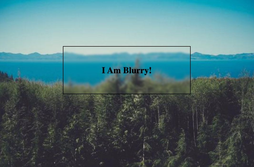
The backdrop-filter CSS property lets you apply graphical effects such as blurring or color shifting to the area behind an element.
There are ton of different effects you can apply (see docs), but the most popular is likely the blur effect:

<div id="parent">
  <div id="child">
    <h3>I Am Blurry!</h3>
  </div>
</div>
div#parent {
  background-image: url('https://i.picsum.photos/id/10/536/354.jpg');
  height: 354px;
  position: relative;
}

div#child {
  /* Apply the backdrop-filter to effect the area "behind" it (e.g. the parent) */
  backdrop-filter: blur(2px);

  padding: 20px;
  border: 1px solid black;
  position: absolute;
  top: 100px;
  left: 25%;
  right: 25%;
  text-align: center;
}